
Core Design Concepts
- Expansive: Each of these clocks is intended to be large.
- Unobtrusive: By default, these clocks sit on your desktop, behind all other windows but just above the desktop.
- Faceless: The essence of a beautiful clock is not its face but its hands and other complications.
- Minimal: "Less is more" rules here. The more visual junk in a clock, the harder it is interpret the time.
- Translucent: Translucency is a key element to the clock elements.
- Customizable: Each clock comes with it's own extensive set of standard as well as specific settings.
- Extensible: Additional clocks are in development which can be added via "in-app" purcases when available. These will range from the classic to the bizarre.
- Evolving: While these are complete and useable as is, please consider these "always under construction." More customizations will be added as well as integration with other relevant apps on your Mac.
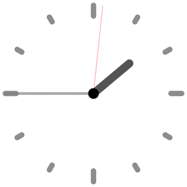
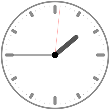
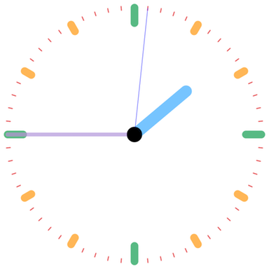
Various customizations of the 3 clocks of LucidTime are presented each as a slideshow. Their size has been reduced to fit this web page. Note how the overall "feeling" of the clock changes with even simple changes to the clock elements.
LucidClock
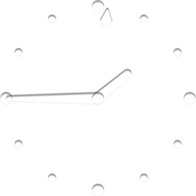
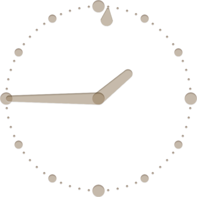
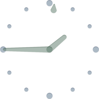
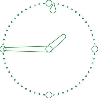
Inspired by the Konfabulator clock widget called Transparent Clock. It provides a bit of graphical depth to the clock element and can be configured in a number 2D and 3D styles. It is the basis for the name LucidTime.app.
Currently, there is a solid style, an outline style, and a 3D indented style.
The default style is the indented style which looks best on solid backgrounds without any colorization. If you have a complex background, turn on "indent fill color" and adjust to suit your desktop.

NixieClock
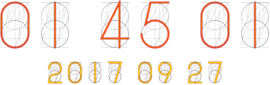
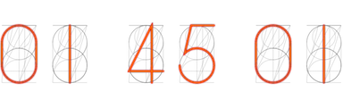


Inspired by the 1950s technology, Nixie tubes. Nixie stood for Numerical Indicator eXperiment 1 and were used as numerical counters on early computers.
NixieClock came about because I felt I needed a digital clock in my clock collection. As I started to work on it, I realized that everybody has done a text-based digital clock in some form or another. So, to make my digital clock truly unique, I turned the clock back, so to speak, to the 1950s.
Both the shape and common numerical ordering of Nixie clocks have been preserved. The only parts missing from a real Nixie tube are the glass and the anode screen in front of all the numbers.
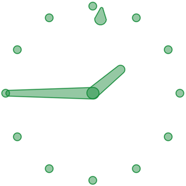
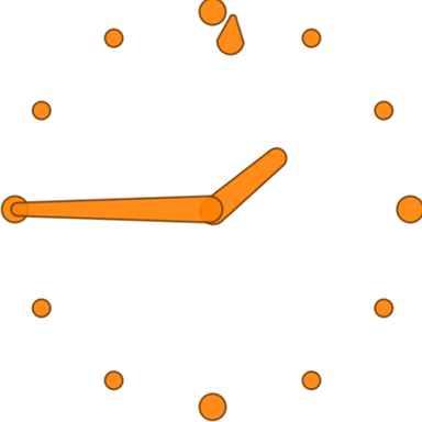
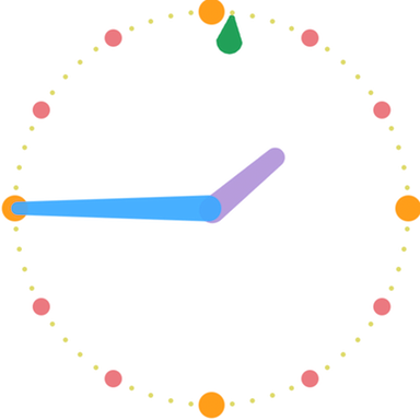
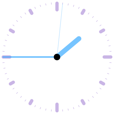
SimpleClock
This clock was conceived and written in a weekend as part of a programming contest. That was a long time ago. It has since evolved to become highly configurable and CPU-optimized—just like the other clocks in this suite.
SimpleClock is brutally spartan. Therein lies its beauty and functionality.
Simple is good.

|
For more information, contact Support at Quarter Til 2. |
Copyright © 2017 QuarterTil2. All rights reserved. |
last modified on November 11, 2017 |